Quick Graphic Design Question


#1

I’ve been searching around for an answer for this and can’t seem to find the right term.

What is it called when a font is made hollow as opposed to solid all the way through? Good example being Jacques Greene’s recent album artwork, which was done by Hassan Rahim:

As well as this from the recent RA feature on Skee Mask:

I’m sure it’ll be a really obvious, easily searchable term but I’m stumped. Thanks in advance.


#2

Outlines, really. Certain typefaces have a workable outline version. Otherwise, just flatten it in illustrator, remove the fill and add a stroke.


#3

Don’t really know what any of that means since I’m a total novice with this stuff but thanks for your help.


#4

lol
basically grab the text you created, hit Command+Shift+O (or CTRL+Shift+O if you’re on Windows) and that’ll turn the text into workable flat vectors. Once you did that just remove the fill color and apply a stroke. And das it.


#5

it’s been awhile since I’ve done this but I seem to remember doing these steps to get that outline effect for text…

  1. use type tool to create your text
  2. group/flatten selection
  3. de-select fill color (white with red slash)
  4. adjust stroke to give you whatever thickness you want your outline


#6

yes on photoshop add stroke and then underneath the opacity setting is ‘fill’, reduce the fill to 0 and only what is left should be the stroke :slight_smile:


#7

Edit: just realized this whole post was unnecessary because you were talking about doing this in Illustrator, not Photoshop, but I’ll leave it here for posterity.

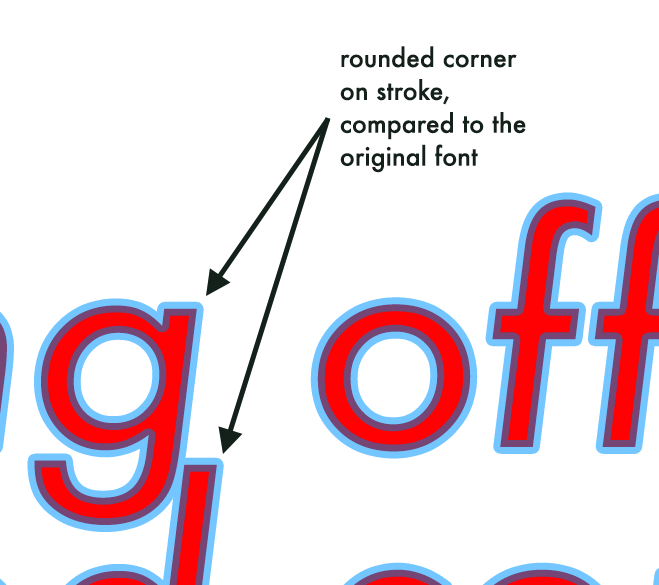
Doing this using the Stroke feature in Layer Styles can create soft corners where there would otherwise be hard corners on a font, which might not be what you want:

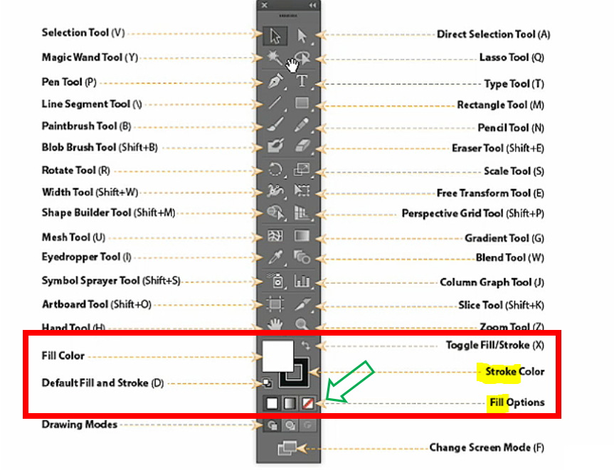
A better way to do this that preserves the vector-scalable nature of the text is, as @dilandau_albatou mentioned, to turn the text into a shape, and then apply a stroke. You can still configure whether it’s an inside, center, or outside stroke using the toolbar buttons in the Path Selection tool.

(Of course, if you do this with shapes, you can still get rounded corners! You just probably won’t want them.)

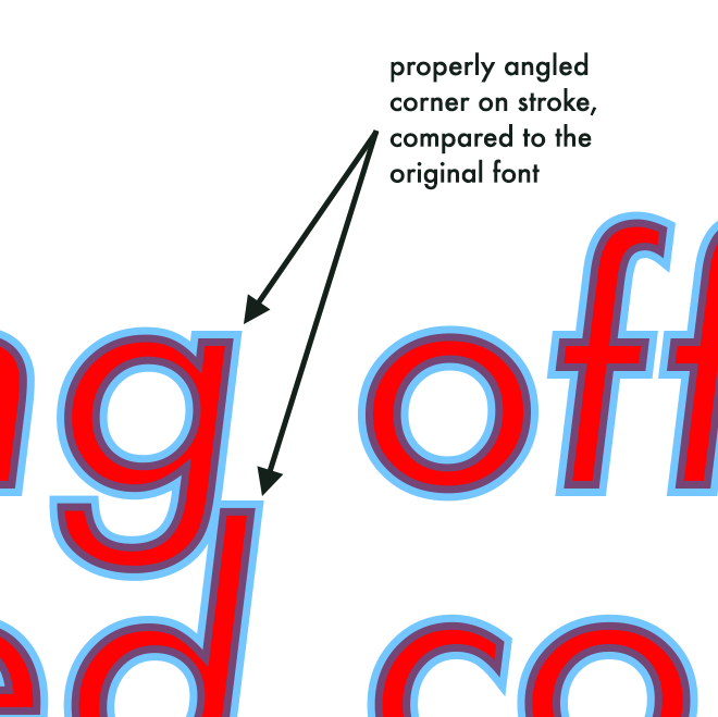
To show off the difference:

Round corners:

Hard corners by turning it into a shape:

(Both of these were done as “Center” strokes.)

It is, of course, usually always better to check if the foundry your font comes from has an outline version already available, as it’ll probably look nicer than doing things this way.


#8

Oh I was talking about Photoshop, you were right the first time. And thank you!


#9

@Purrl love this demo of a detail I did not consider! I suppose there are certain variables that could inform the layout approach one way or another (stroke width, kerning, etc., or maybe you just want a softer look but don’t want a serif font, who knows…).