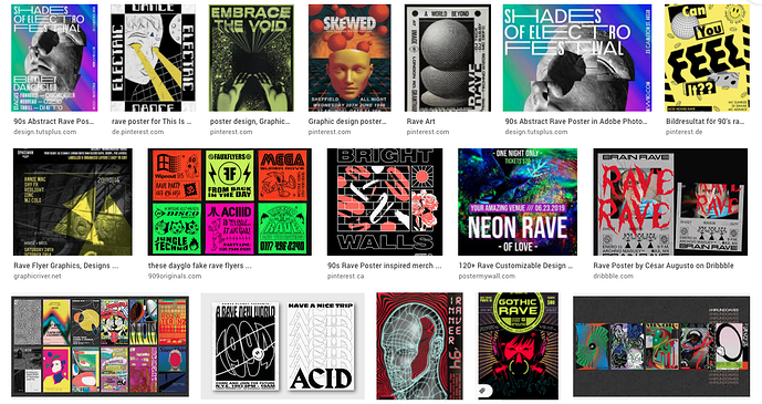
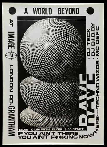
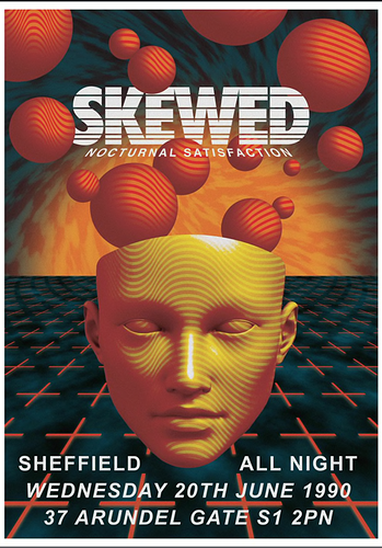
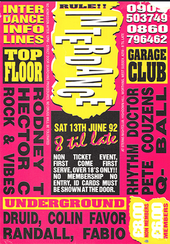
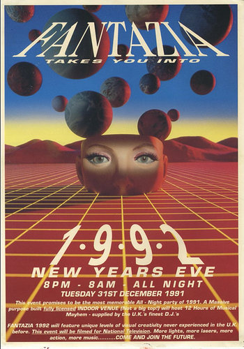
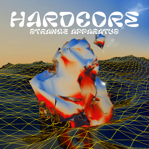
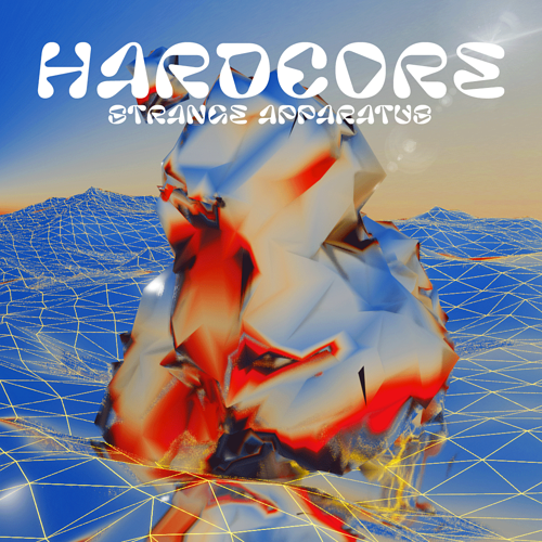
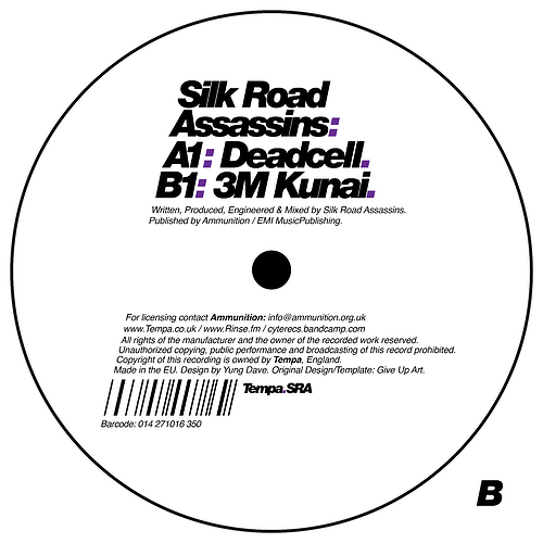
I’m not sure exactly yet - it would be in a square format, probably the title would be “Hardcore” and it would ideally have “Strange Apparatus” on there in a less prominent way. I like the idea of it being fairly simple and graphical rather than too text-heavy.
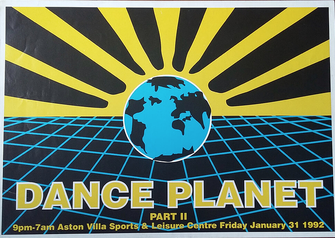
I like things where there are 3 colours, maybe yellow, red and black, like in the Dance Planet one above? You might be able to get an idea of the shades of colour I like from looking at the artwork on my other mixes. But I kind of like warm & strong, not too neon, not pastelly - sort of a middle ground. Primary colour style. I don’t know if any of that makes sense! Just do what you feel is good. If you wanted to do it in a flyer style you could pretend it was an event from some time in 1992 at this location.
Is there anything else it’d be helpful to know?

