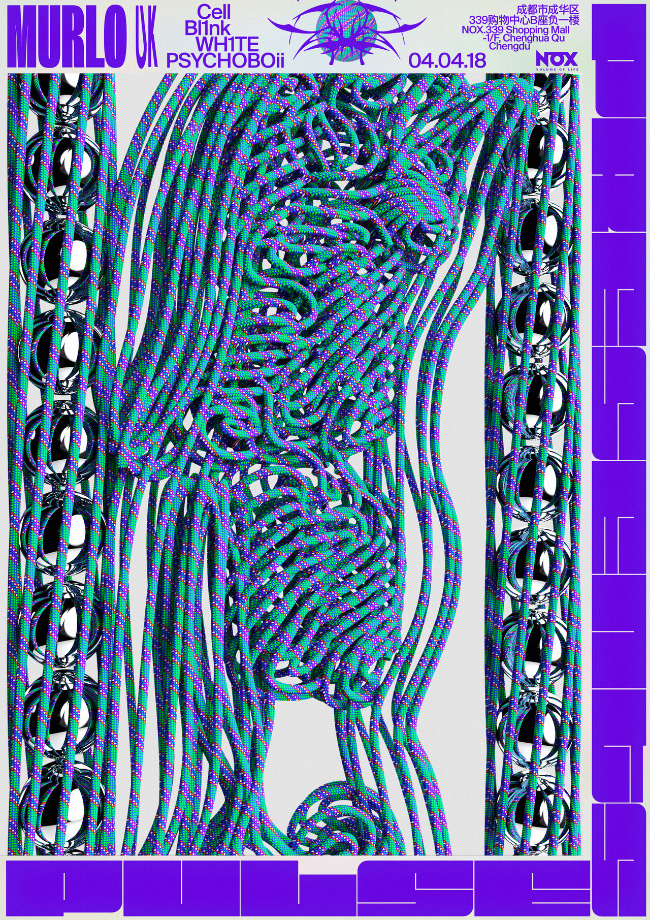
I’ve been loving the resurgence of busy multi font visual works like David Rudnick’s design.
How many fonts before it’s too much? Post your favourite ridiculous multi-font flyers
I’ve been loving the resurgence of busy multi font visual works like David Rudnick’s design.
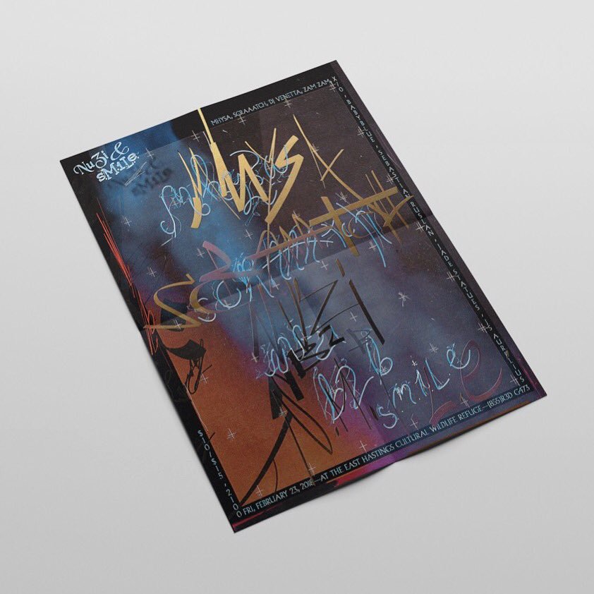
I recently became interested in the same kind of design, i cant remember specific designs but i can give you some name or people doing similar stuff : Mikey Joyce, Collin Fletcher and Jack Kimberley.
Dunno about “multi-font” but this guy’s work on the new OPN album is stellar and, most surprising, the design on CD is better than Vinyl?
This is interesting too https://walkerart.org/magazine/uncovered-001-young-fathers-against-all-logic-total-control
(Also outline fonts are sooo trendy right now)
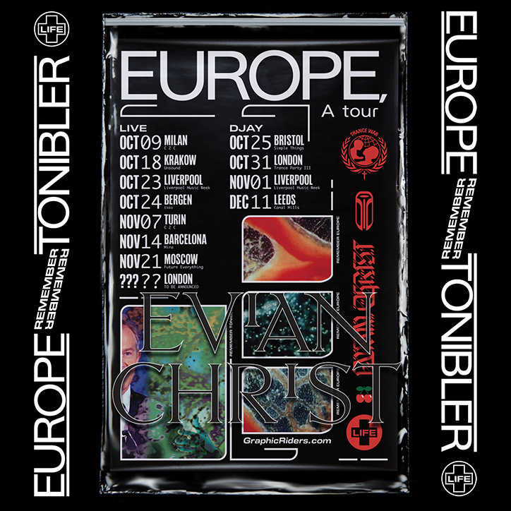
Not ridiculous in any way but I really like the work of Alex McCullough, who does the artwork for the Whities label and related clubnights. He mostly uses two of three quite different typefaces which always create quite nice juxtapositions
always appreciate when an artist or designer is so synchronized with/sympathetic to the music itself
jomes.bloke the OPN album is what made me sit up and take notice, before realising he had done a few other pieces I really liked. thanks for the suggestions everyone, there’s some great work there. i think this is my favourite so far maybe? https://www.instagram.com/p/BirwpCZnpxu/?hl=en