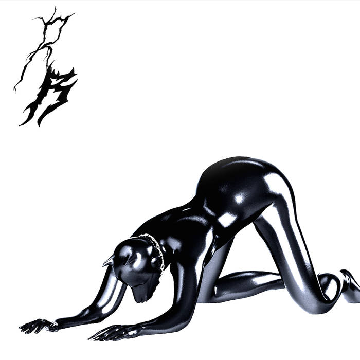
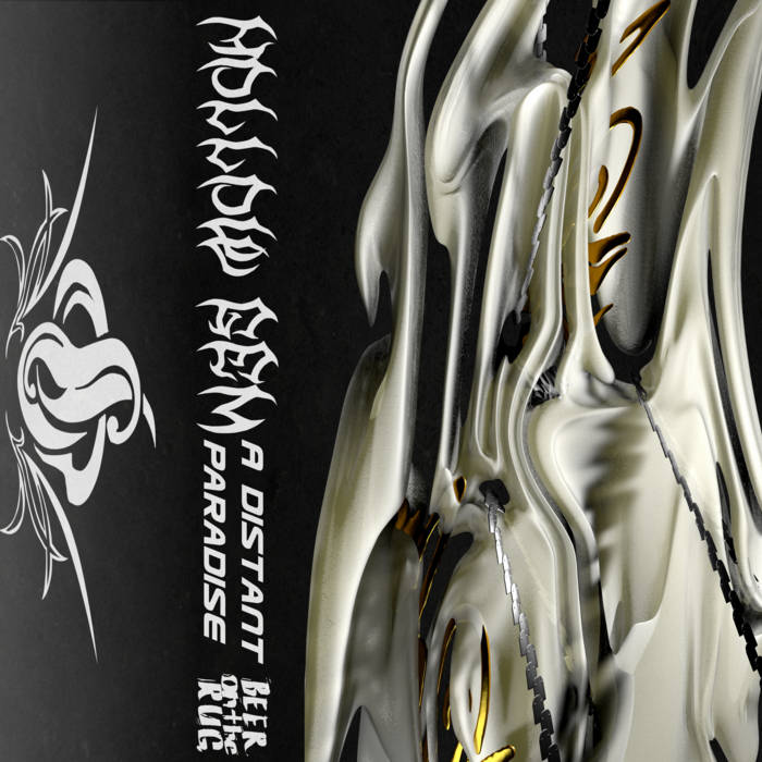
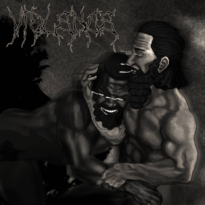
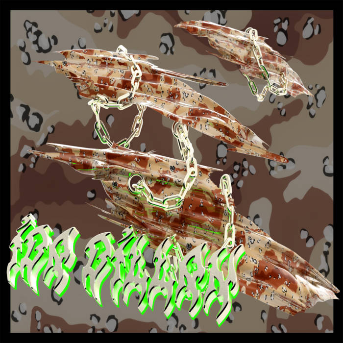
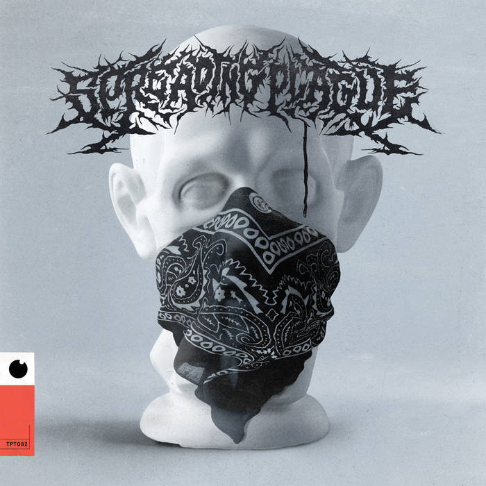
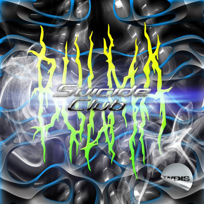
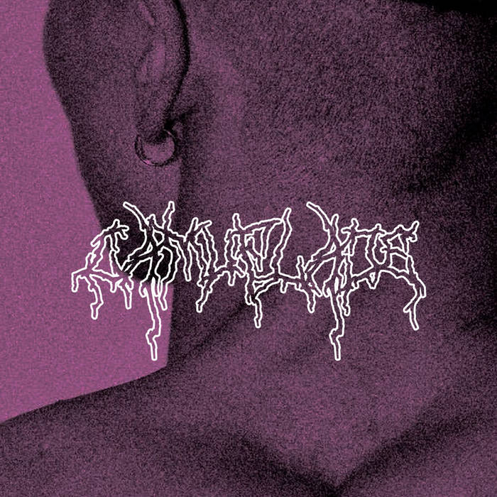
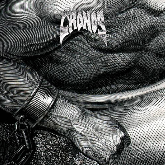
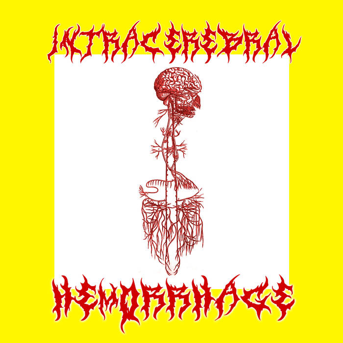
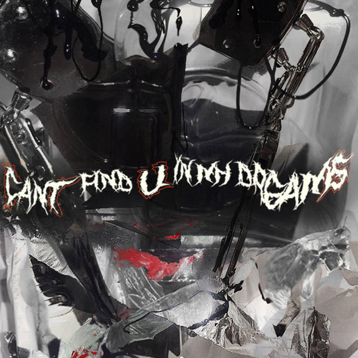
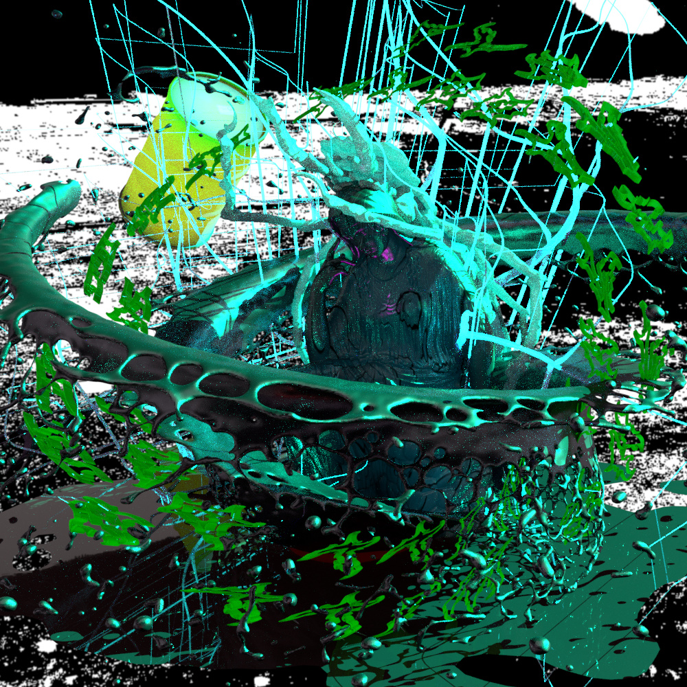
fire, gore, twisted chrome, MSPaint, grotesque CGI, splatter, gabber
what is the relationship between black/death metal iconography and deconstructed club music?
do you think this design trend is innovative or uninspired?
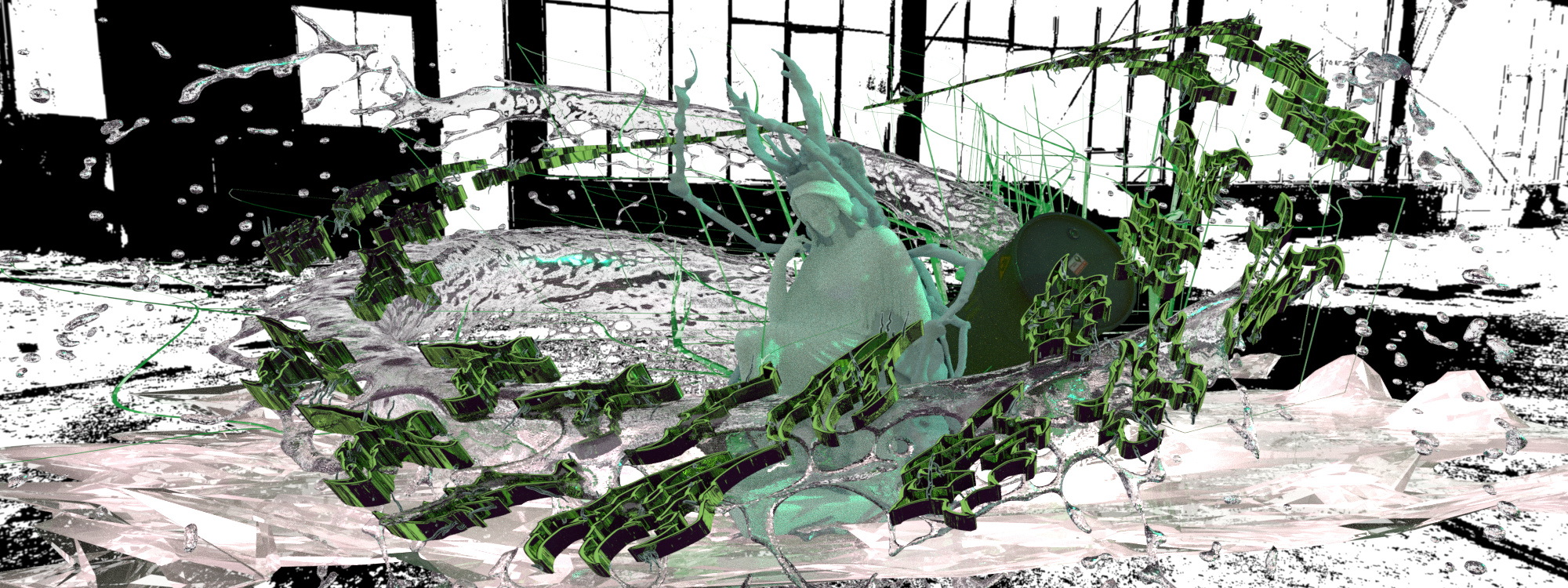
fire, gore, twisted chrome, MSPaint, grotesque CGI, splatter, gabber
what is the relationship between black/death metal iconography and deconstructed club music?
do you think this design trend is innovative or uninspired?
tbh i’m torn, given im playing into aesthetics coming from crust/blackmetal/osdm whatever background and evolving alongside the bitter edge of electronic music all the like
i’m into it. it’s like occam’s razor of edginess but i feel like the encapsulation of frustration and angst that nu-metal/black metal holds tru is easily expressed in the outer fringes of the “deconstructed xxx” genres
maybe it’s a rehashing of the angry/angsty youth in the cyber-dystopia of bleak and endless voids of belonging and feeling that recall atmospheres of isolation and cold akin to black metal
maybe it’s just the perspective of inner turmoil (esp as a trans folk raised on the internet) being relinquished into the next nu Web.0 tying together the nostalgia of extreme metal and suffering i dunno
here’s some bullshit tho:
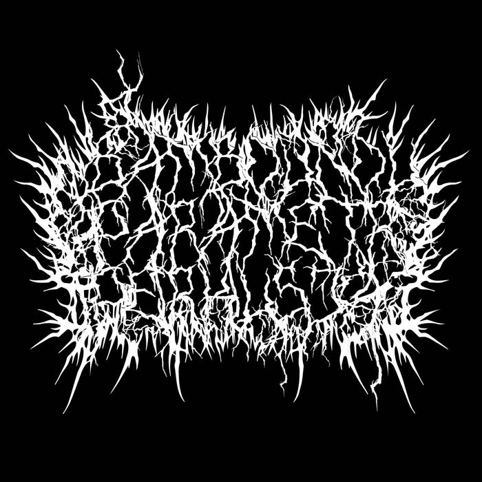
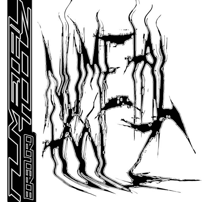
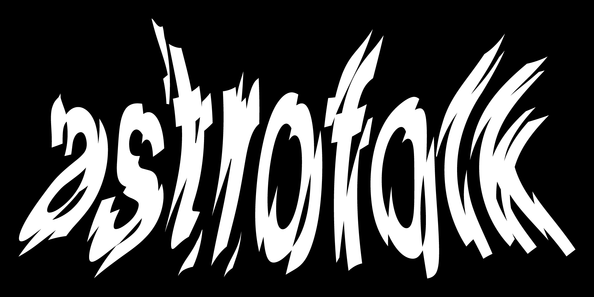
damn, this goth / black metal typography is so… 2016/2017  (at least within my own recent memory of club music)
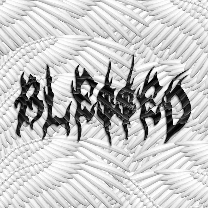
IMO the use of metal iconography within deconstructed club music is sort of a progression of “net art” in general. One of the best examples I can think off the top of my head is from WWWINGS (pretty sure they made the artwork for 13th one, BLESSED is one of their EPs). They used to go under the name BWWWOYS and they still made artwork for their stuff, but more in the vein of ~2013 vaporwave tumblr URL-based aesthetics.
Soooo… from the ashes of tumblr vaporwave-inspired circa mid-early 2010 art… we get goth fonts.  (I really don’t rate vaporwave though I always sorta hated it lol) It’s all tied to trends, what’s hot, what a lot of other people are doing.
IMO (before WWWINGS got disbanded) their new art is definitely better quality.

yeah that sounds about right 
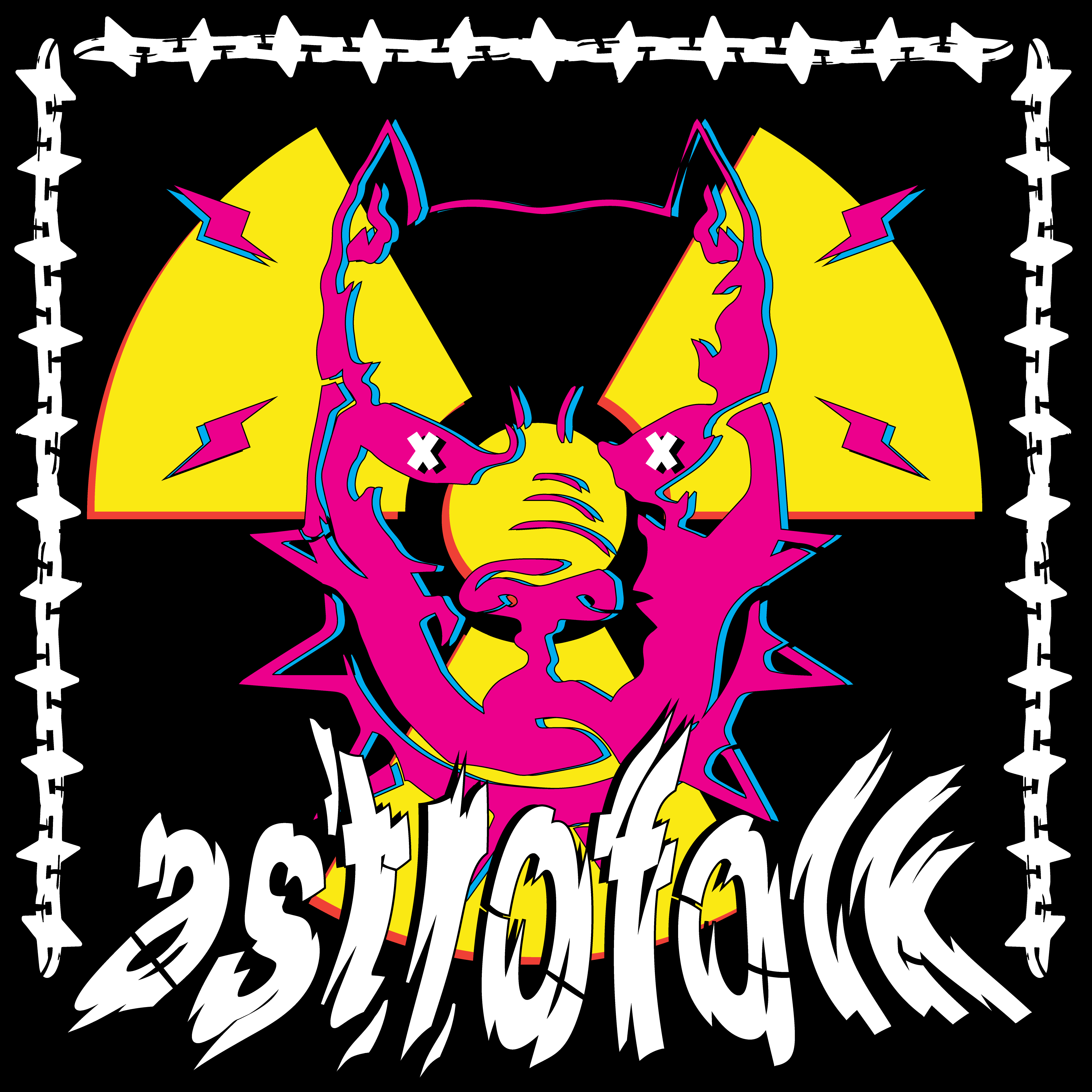
i’m kinda torn myself, too. some of it i think is really innovative and fresh (e.g. @astrofolk your first example and/or esp. like @Yung_Dave said, the examples that embody that logical progression of net art aesthetics as it relates to the natural evolution of vapor/post-club sounds), and some of it is clearly bandwagoning.
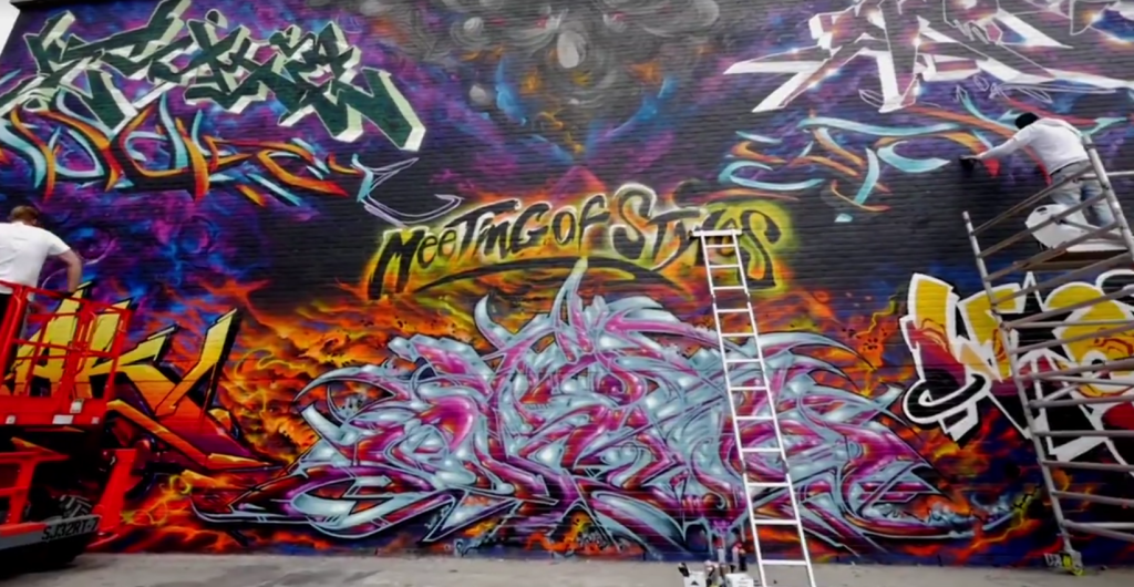
and from a design standpoint i find it v similar to rave/club iconography from the 90s UK graffiti scene in terms of actual glyphs and serif formats and typographical bs lol 
absolutely! i was actually thinking about graf styles too as i was picking through some of those covers. perhaps unconsciously it’s a way that artists self-identify/claim affiliation to a larger movement
also it keeps kinda in line with the current topical design buzzword “maximalism” eh :+)